Artwork Specifications:
What file types work best?
As you can see by the provided raster vs vector chart, vector images result in much cleaner images, and provide us with versatility, and time saving properties that raster files do not. We will always prefer to use vector files whenever possible. If no vector file is available, you may send us a raster file. Raster files need to be at least 300dpi and sized similar to the size they will be printed in order for us to use them. There may be additional fees when sending us raster files, because we will need to spend extra time to recreate, clean up, and/or separate the art manually. If all you have is a raster file please send it to us, and we will let you know if it will require additional fees and provide you with an estimate on what they will be.
Raster VS Vector:
Raster images:
Raster images are made up of thousands of tiny pixels to create shading and color variations for full color images like photographs and web graphics.
- When you increase the size of a raster image, the pixels stretch, become larger, and cause the image to look distorted or pixelated.
- They are much more difficult and time consuming to separate colors for screen printing.
- They are not as easily editable as vector images.
- Examples of raster file types: jpeg, png, bmp, tiff, gif, psd
Vector images:
Vector images are made up of pixels like raster files, but when they are resized, the computer re-samples the image and creates more pixels instead of stretching them, making the image appear the same at any size. Vector graphics are most commonly used for spot color printing.
- They have crisp hard lines, that result in a much cleaner finished look.
- They are already separated into individual colors, which saves time.
- They are easily editable both in color and shape.
- Examples of vector file types: ai, pdf, eps, cdr
For a full list of accepted file types please see section below.
What are spot colors?
Most of the printing that we do is spot color based. What that means is that we use a color system called the Pantone Matching System (PMS for short). The Pantone Matching System is a color match system that is used in printing to enable printers to make colors universally accurate. They include color recipes that are used to mix colors, so that the colors are always true wherever they are being printed. You can view the Pantone Matching System spectrum by clicking the photo, but please be aware that the colors you see on your screen will not be accurate. It does however, give you an idea of what the system is and how it's used. In order to see the Pantone Matching System colors accurately, you will need a PMS formula guide such as the one pictured here.
The printing process & colors
Once you send your art or logo to us to evaluate, we can determine how many colors it will take to print by separating the colors into individual spot colors. We will let you know how many colors it will be and what the cost is to print. Below are some answers to commonly asked questions regarding colors.
Why do you need an underbase?
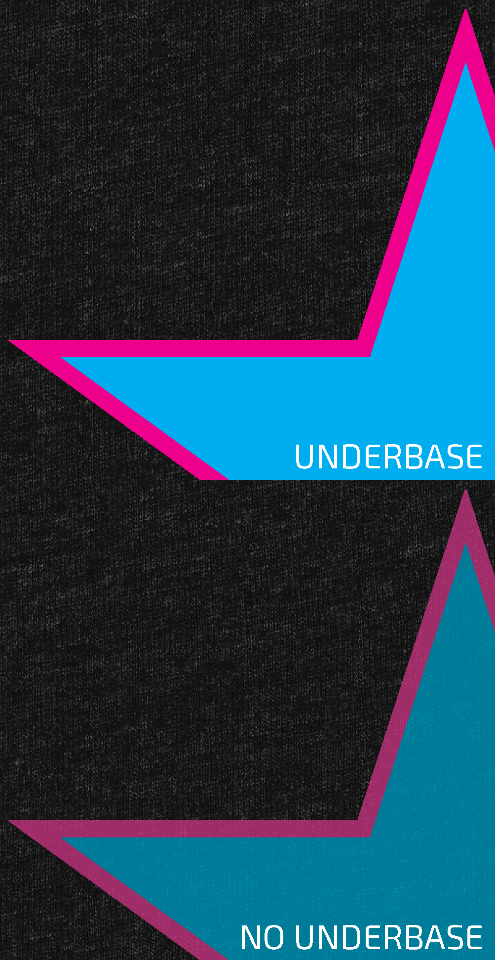
When printing light colors on dark garments, it is necessary to first print what is called an underbase. The underbase is an undercoat of white that is printed underneath any colors of a design that are brighter than the color of the garment being printed. Bright inks are somewhat transparent, printing them without an underbase can cause undesired results, making them look dull and dingy. It also helps to block the dye of the garment from bleeding into the brighter color and causing it to look discolored.
What is the maximum amount of colors we can print ?
We have the ability to print up to 10 colors on light garments. On dark garments where an underbase is needed, we can do up to 9 colors.
Color accuracy:
It is a fact that everyone perceives colors differently. While the Pantone Matching System was designed to help with this problem, there will always be different opinions on the subject. We will always do our best to match spot colors as accurately as possible. But because of the variables involved with screen printing, colors can be altered in many different ways. Ink colors can change based on the color of the garment being printed, they can also change slightly from the beginning to the end of a run, and they can change depending on the lighting that the color is being viewed in.
What are half tones?
A lot of people ask this question. In spot color printing, when there is an image that varies or blends in color, such as a photograph or gradient, the image will print as halftones. Halftones are tiny dots that make up the detail in an image. Halftone dots are basically the printing equivalent of a pixel on your screen. But because the holes in a silk screen are much larger than pixels on your screen, the halftone dots are also larger. Much like a fine painting, when halftones are viewed too closely, they may not look as clean, but at the proper distance, they look normal.
What are complex separations?
Images that have many color variations or gradients such as photographs, require several different types of processes in order to separate the colors for screen printing. These processes are much more difficult and time consuming than vector spot color separations. They print in halftones, and there are some rules involved in relation to what colors of garments they can be printed on. Because of color restrictions, not all images can be screen printed.
Types of complex separations:
- 4 Color Process (CMYK): This is used for photographic images that have too many colors to separate into spot colors. This process is very similar to an ink jet printer, and can only be done on white garments, as the white of the garment serves the same purpose as the white of paper.
- Simulated Process: This is the most commonly used complex separation. This is used when an image has fewer colors that blend together like the picture of the dog. It creates an artistic dramatic look. This process can be done on dark garments.
- Grayscale: This is similar to the simulated process, but is used for grayscale images only. It is used to blend the tones between the blacks, grays, and whites to create a smooth finished look. This process can also be printed on dark garments.
Accepted file types:
Vector:
- Ai (Adobe Illustrator Preferred)
- EPS
- Id (Adobe InDesign)
- Please save any Corel Draw (.cdr) files as a PDF before sending them to us
*Note that just because an image is saved under one of these file types does not necessarily mean that the art is vector, for instance placing a raster file into Illustrator and saving it out as an Ai file does not make the raster file vector, the art must be recreated as vector art in order for it to be vector.
Raster:
- Ps (Adobe Photoshop Preferred)
- Jpeg
- Png
- Tiff
*Raster images must be at least 300dpi and must be sized similar to the size it will be printing at in order to use. Additional art charges may apply with raster images. Not all raster images are usable.


